
Gimp Tips - Parchment
Think you could have done a better job than 'ol Tom Jefferson at writing the Declaration of Independence? Well this is how you can do it and make your writing look authentically old and founding fatherish.
It is very important that you use a good font for this to look at all right. You need a handwriting font, and one that looks like old handwriting. I recommend Jefferson or if you have money to spend, anything from TexasHero.com.
 First, fill the background layer with the color (243,229,180) (that means
select red:243, green:229, and blue:180).
First, fill the background layer with the color (243,229,180) (that means
select red:243, green:229, and blue:180). Add a new layer and fill it with (246,238,214).
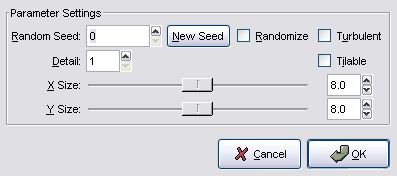 Add a layer mask to this upper layer and fill it using
Filters|Render|Clouds|Solid Noise. Set the detail level to 1 and both
sizes to 8 (you may need to adjust the size based on the size of your
image; play around with it and see what looks best for you).
Add a layer mask to this upper layer and fill it using
Filters|Render|Clouds|Solid Noise. Set the detail level to 1 and both
sizes to 8 (you may need to adjust the size based on the size of your
image; play around with it and see what looks best for you). The result is a nice parchment-like surface to write on.
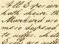 Now add your text. Select a good handwriting font that fits the
period and use the color (88,60,21).
Now add your text. Select a good handwriting font that fits the
period and use the color (88,60,21).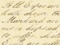 It still doesn't look quite right, because back in colonial days the
paper wouldn't take the ink this perfectly, and the quill pens people
wrote with didn't always contact the paper this exactly. So we need to add
some flaws to the ink. Add a layer mask to the text layer and fill it
using Filters|Render|Clouds|Solid Noise. This time set the sizes to
16.
It still doesn't look quite right, because back in colonial days the
paper wouldn't take the ink this perfectly, and the quill pens people
wrote with didn't always contact the paper this exactly. So we need to add
some flaws to the ink. Add a layer mask to the text layer and fill it
using Filters|Render|Clouds|Solid Noise. This time set the sizes to
16. Now adjust the result with Colors|Brightness-Contrast on the layer
mask. Here, more brightness equals more ink on the paper and contrast
is how strong the difference is between where the ink took and where it
didn't. I used +75 brightness and +95 contrast.
Now adjust the result with Colors|Brightness-Contrast on the layer
mask. Here, more brightness equals more ink on the paper and contrast
is how strong the difference is between where the ink took and where it
didn't. I used +75 brightness and +95 contrast.
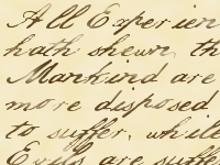
There you have it. Feel free to rewrite the Declaration, the Constitution, or whatever founding document or statement of principles you choose. Lord knows we've seen enough of that lately.