
Gimp Tips - Woodcut
Here we're going to take a photograph and give it a line-y woodcut sort of look like you might see on a stamp or in a colonial era illustration.
 This beautiful woman (photo by Tim
Howley) is my wife, Libby. I took this picture of her and made a
fake stamp out of it once. This is how I prepared the image.
This beautiful woman (photo by Tim
Howley) is my wife, Libby. I took this picture of her and made a
fake stamp out of it once. This is how I prepared the image. The first step is simply to switch it to grayscale by selecting
Image|Mode|Grayscale.
The first step is simply to switch it to grayscale by selecting
Image|Mode|Grayscale. Applying this treatment to the background would just be distracting,
so I painted it out with white, leaving just the beautiful woman.
Applying this treatment to the background would just be distracting,
so I painted it out with white, leaving just the beautiful woman. You want areas where there are no lines going across as well as areas
that are all filled in, so you have to tweak the brightness and contrast
until the light areas are truly white and the dark areas are black. I
did this by using the color picker to identify the value of some of the
darker areas and the value of the area on her forehead that I wanted to
be white. Those values turned out to be 30 and 180. So in the curves tool
(Colors|Curves) I slid the lower dot over to (30,0) and slid the
upper dot over to (180,255).
You want areas where there are no lines going across as well as areas
that are all filled in, so you have to tweak the brightness and contrast
until the light areas are truly white and the dark areas are black. I
did this by using the color picker to identify the value of some of the
darker areas and the value of the area on her forehead that I wanted to
be white. Those values turned out to be 30 and 180. So in the curves tool
(Colors|Curves) I slid the lower dot over to (30,0) and slid the
upper dot over to (180,255). Next I added a new layer on top and filled it with a pattern of lines
like the one pictured here. It has to be a pattern that shifts from black
to a value around 170 and back smoothly. The thickness of the pattern
depends on the image you're using. You usually want to have about 50 to
60 lines covering your whole image. This pattern
file is what I used and simply did a pattern fill on the new layer.
Next I added a new layer on top and filled it with a pattern of lines
like the one pictured here. It has to be a pattern that shifts from black
to a value around 170 and back smoothly. The thickness of the pattern
depends on the image you're using. You usually want to have about 50 to
60 lines covering your whole image. This pattern
file is what I used and simply did a pattern fill on the new layer. When I set the mode for that new layer to Addition, it starts to look
like it's heading in the right direction. Flatten this down to one
layer (Image|Flatten Image).
When I set the mode for that new layer to Addition, it starts to look
like it's heading in the right direction. Flatten this down to one
layer (Image|Flatten Image).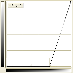 Next I went into Colors|Curves and I slid the bottom point over to
(171,0). 171 is one point brighter than the brightest color in the line
pattern I used.
Next I went into Colors|Curves and I slid the bottom point over to
(171,0). 171 is one point brighter than the brightest color in the line
pattern I used. This is the result. Realisticly, if you were making an actual woodcut,
the lines wouldn't all be perfectly horizontal, but this gives the idea
and looks pretty good.
This is the result. Realisticly, if you were making an actual woodcut,
the lines wouldn't all be perfectly horizontal, but this gives the idea
and looks pretty good.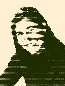 In black and white it looks a bit stark. Colorizing it softens up the
look a little. After shifting it back to Image|Mode|RGB you can color
it however you want.
In black and white it looks a bit stark. Colorizing it softens up the
look a little. After shifting it back to Image|Mode|RGB you can color
it however you want.